A set of panoramas is a photo gallery you can spin around. A virtual tour that does real work for a business needs more. Here is what separates the two.
Navigation people understand without instructions
Visitors should move through the space the way they would walk it: forward, around a corner, into a room. Clear hotspots, a simple map, and a way to jump to the area they care about keep people exploring instead of getting lost. Test it with someone who has never seen the space.
A story, not just a scan
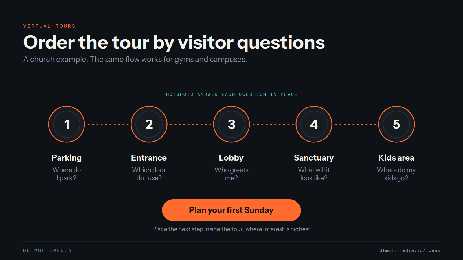
Decide what the visitor needs to learn. A first-time church guest wants to know where to park, which door to use, and where their kids go. A prospective gym member wants to see the floor, the equipment and the locker rooms. Order the tour and place the details around those questions.
Accessibility from the start
Descriptive text for key scenes, keyboard navigation, readable contrast and controls sized for touch all widen the audience. They also make the tour work better on a phone, which is where most people will open it.
Calls to action where interest is highest
The moment someone has seen what they came to see is the moment to ask for the next step. Book a visit, plan your first Sunday, request a membership tour, send an inquiry. Place those prompts inside the tour, not only below it.
Analytics that show what people look at
Know which rooms get visited, where people drop off, and what happens after the tour. That tells you what to show first, what to add, and whether the tour is bringing in real visits.
Built to fit the site it lives on
A tour should feel like part of your brand and load fast on a phone. Embedded on your own site and shareable by direct link, it can work in email, social posts, QR codes and search results.
For Union Fit Hub we built a 360 tour with interactive navigation and separate paths for members and event bookings, inside a responsive web experience. See it on our work page, or tell us about your space.