A visitor's experience with your organization does not begin at the front door. It starts on a phone, usually with a search, and it continues on the screens inside your building. When those two feel like different organizations, people notice.
One visitor, several touchpoints
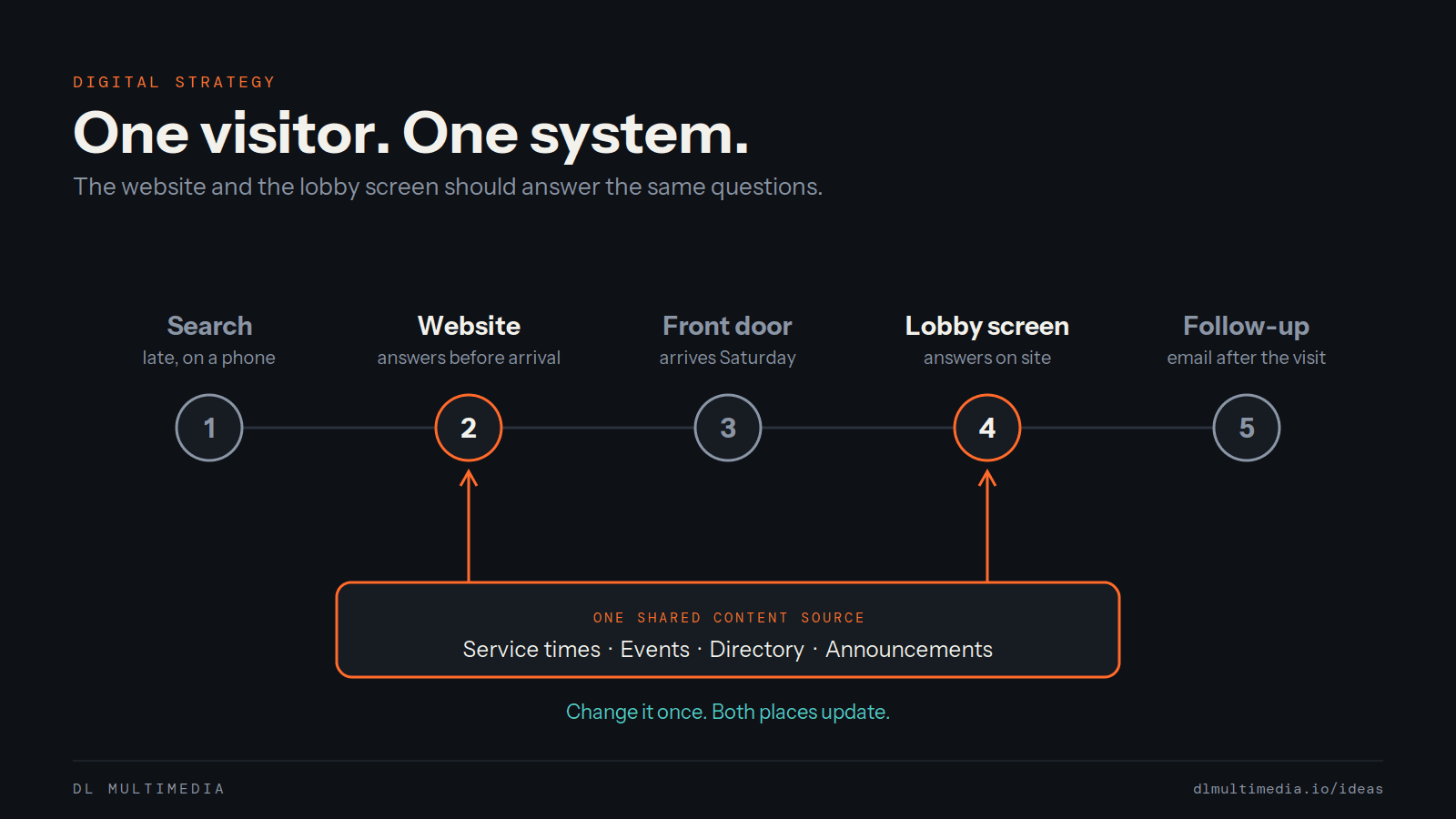
Someone looks you up at night, scans your site, shows up on Saturday, checks a screen in the lobby for directions, and goes home to an email. That is one journey. When the website and the lobby screen are planned separately, nobody owns the handoffs between them.
Share the content, not just the colors
Matching logos helps, but the bigger win is shared content. Service times, events, directories and announcements should come from one source, so a change in one place updates the other. That cuts the work for your staff and ends the outdated sign problem.
Answer the same questions in both places
Visitors want to know where to go, what is happening today, and how to take the next step. The website answers before they arrive. The lobby screen and wayfinding answer once they are inside. Use the same words and the same structure in both so the experience feels continuous.
Design for the room and for the phone
A lobby screen is read from a few feet away by someone on the move. A website is read up close by someone sitting down. Share the strategy and the tone, then design each one for how it is actually used.
Start small and connect as you grow
Begin with the one question your team answers most often, and make the website and the screen answer it the same way. Add a virtual tour, a directory or a video wall as the budget allows, all fed by the same content system.
This is how we approach every project, from interactive kiosks and video walls to the websites behind them. If your site and your space tell different stories, start a project with us.